You're calculating population density incorrectly
The question “how do you calculate population density?” sounds like the kind of thing you’d see on a third grade pop quiz. Obviously, you would calculate it in the same way you would calculate any other type of density: you take the feature of interest and its population, and divide by area.
The issue is that this approach assumes that every part of the region of interest is equally valuable.
Why do we care about density?
For example, consider the following two islands:
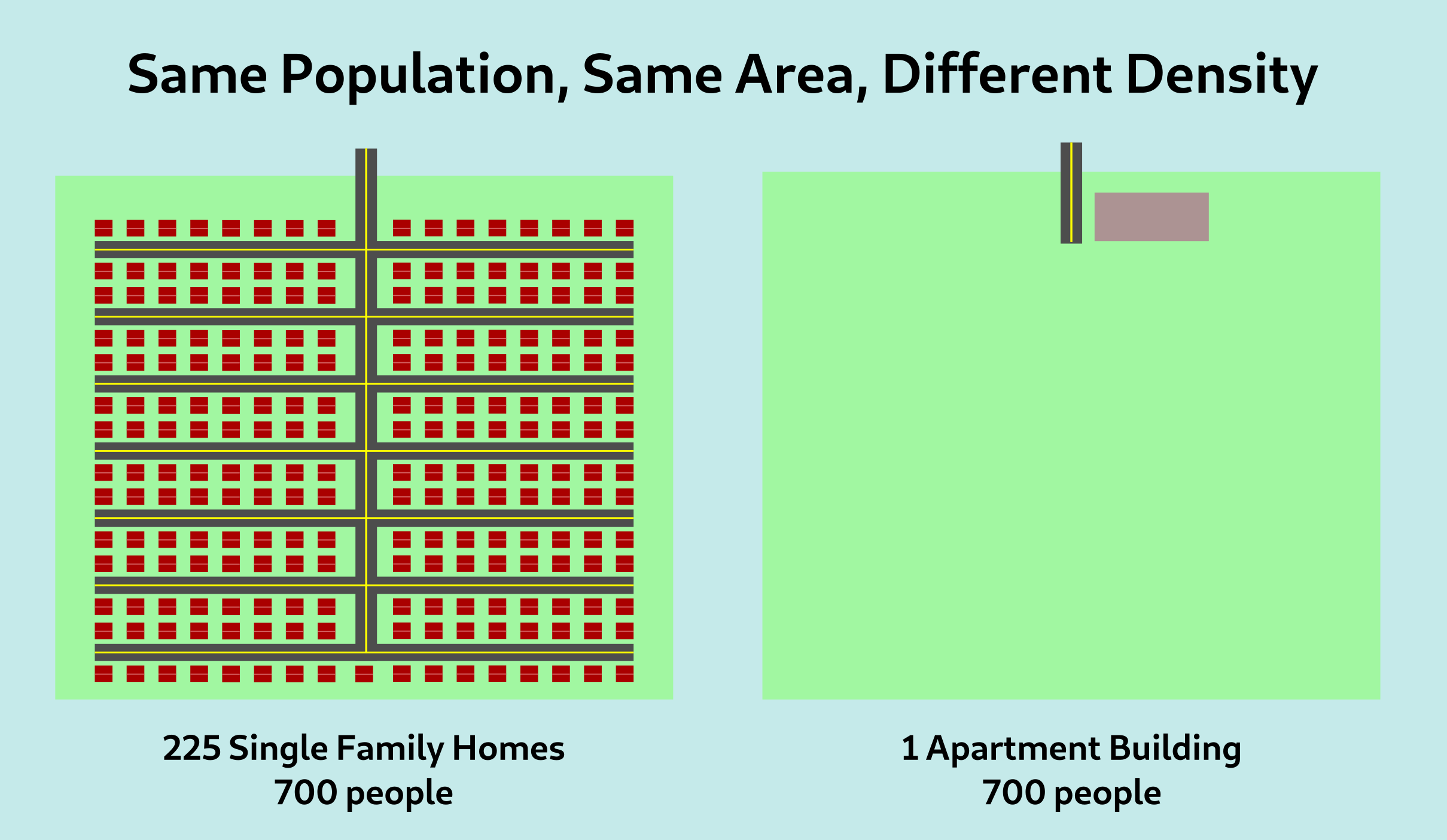
In both islands, the population is 700 people, and the areas are also identical. So by a standard population density metric, the two islands are the same “density”. This metric, however, misses something. The island on the right is far more dense than the one on the left, as perceived by the typical inhabitant of the island.
In practice, when we refer to density, we’re really referring to the density as experienced by people. Walkability, the viability of public transit, social trust, access to services nearby: all of these have to do with people and their interactions with other people. As such, a density metric that does not account for this will inevitably fail to capture that relevant context.
What is standard density measuring?
This seems like a strange question – obviously, it is measuring the mean number of people in every square meter of ground. However, another way to think about this is to divide our region up into smaller subregions; for example, let’s say each island is 1500m on a side and divide them into 9 regions each of 500m by 500m.
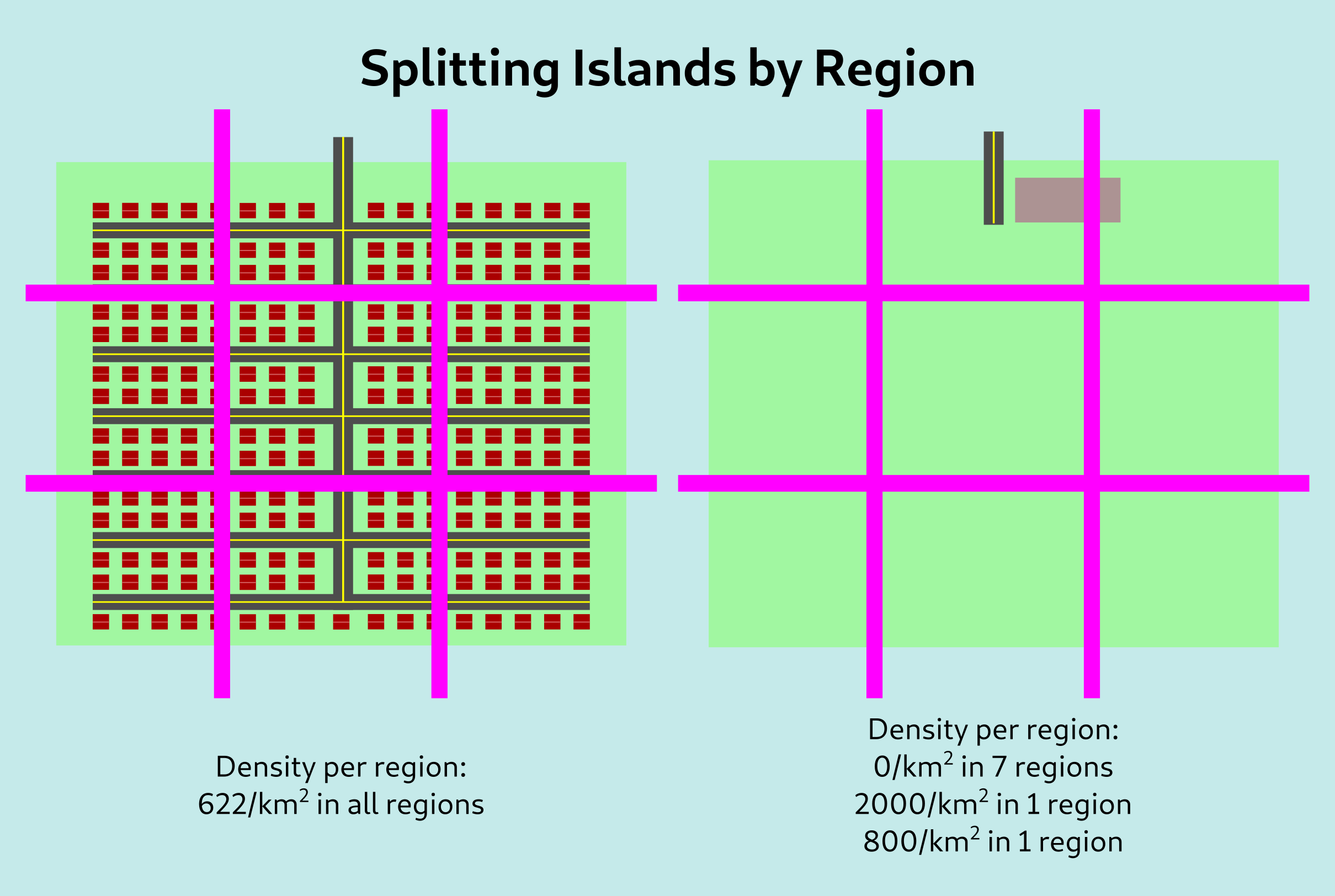
To calculate normal density, we would take the average of every region, weighted by its area, to get 622/km2 in both of these cases. However, if we take the average of every region weighted by the population, we still get 622/km2 for the left island but we get 1657/km2 for the second island. This better reflects our intuition about the second island being more dense.
A practical metric
Of course, the issue with the above approach is the grid. If we had displaced the grid slightly to the right so the entire apartment building fell within it, we would have ended up with a density of 2800/km2, and this kind of sensitivity to minor changes is really not what we want in a metric.
Instead of looking at a grid, we can instead look at disks of some radius, with one disk centered around each person. We compute the density in each disk, and then take the average of all these values across the region to compute the overall density.
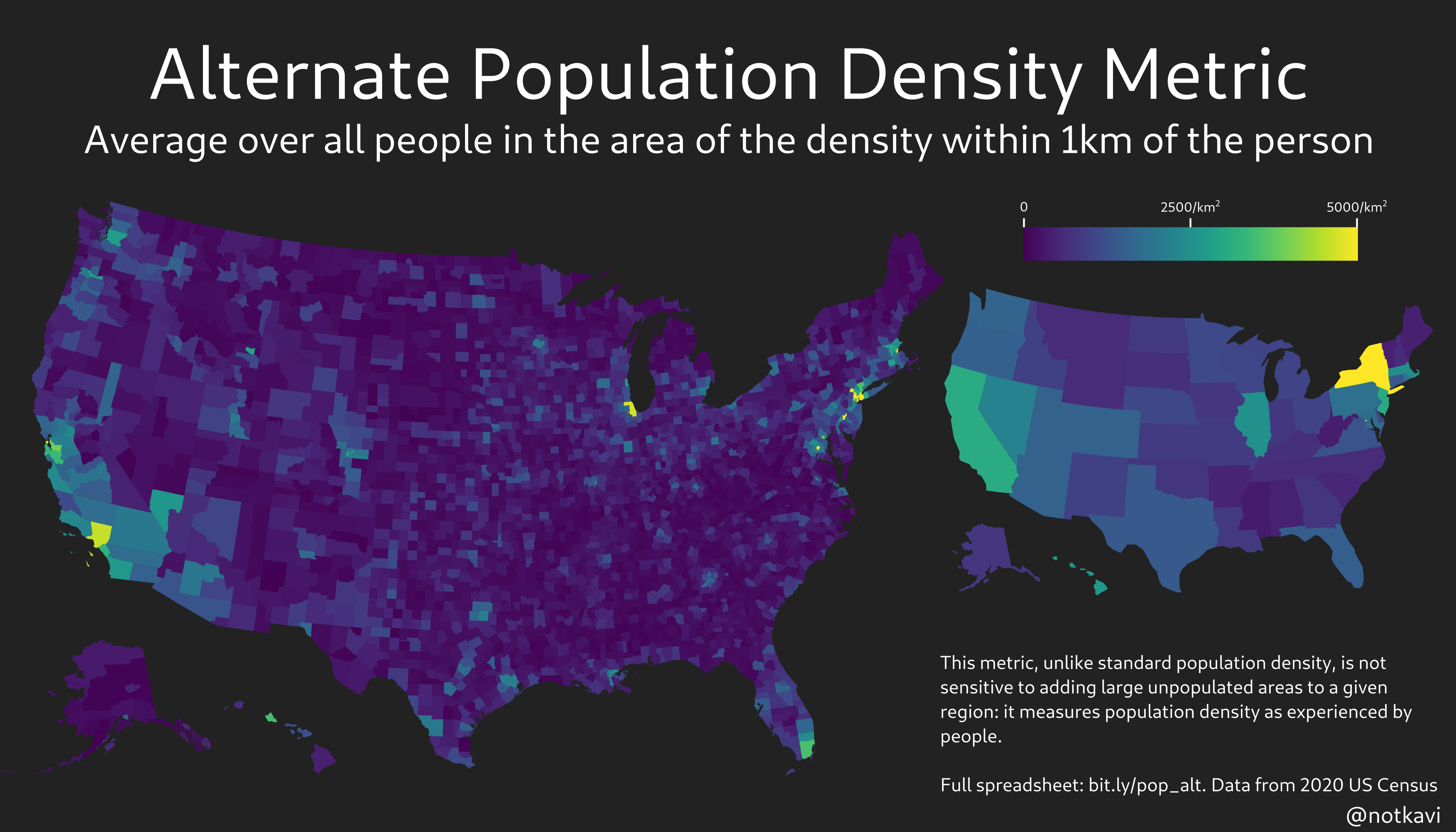
Maps
And now for some maps! Depicted here are maps of the metric for radii of 250m, 1km, and 4km, based on 2020 census data.
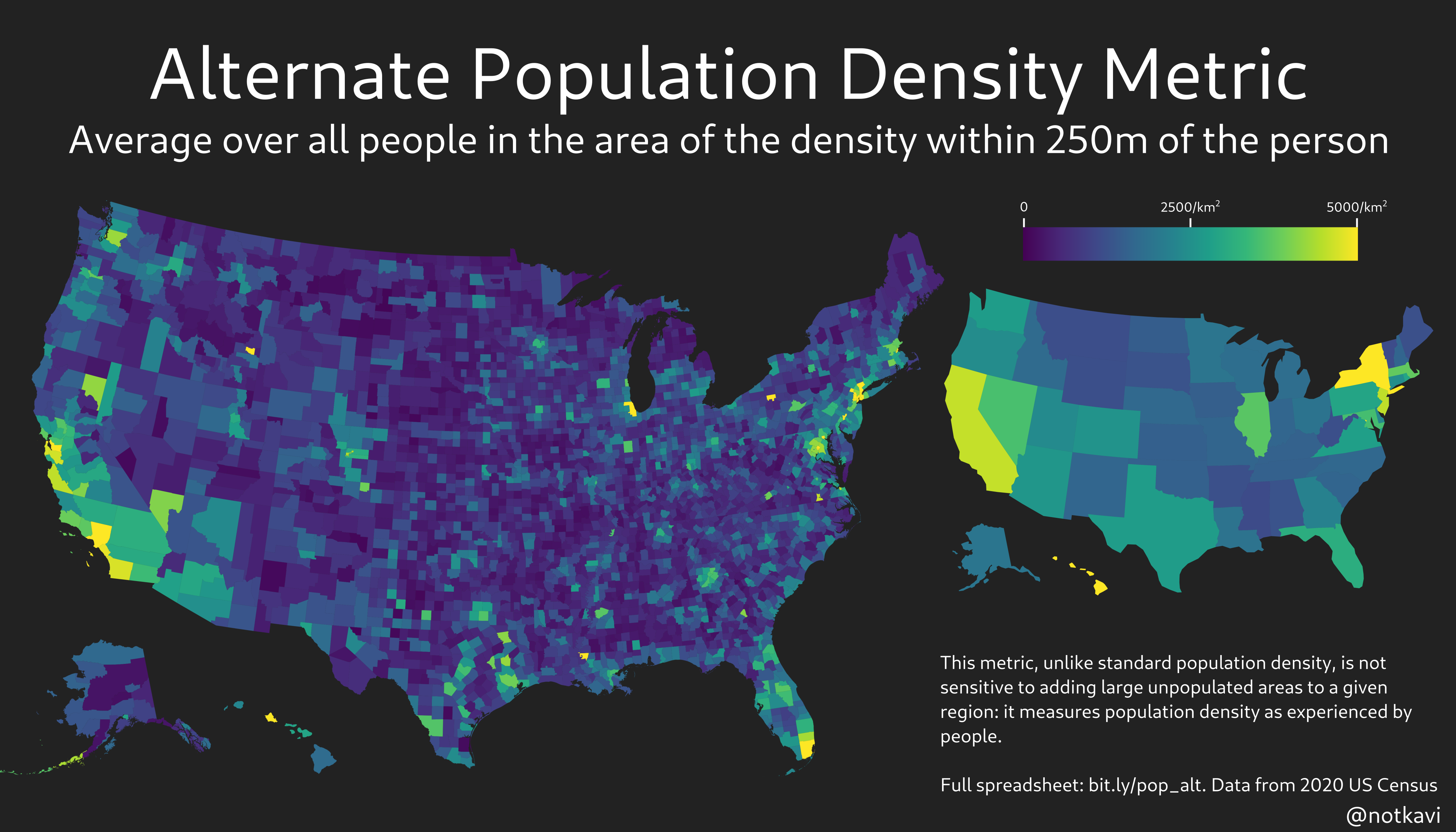
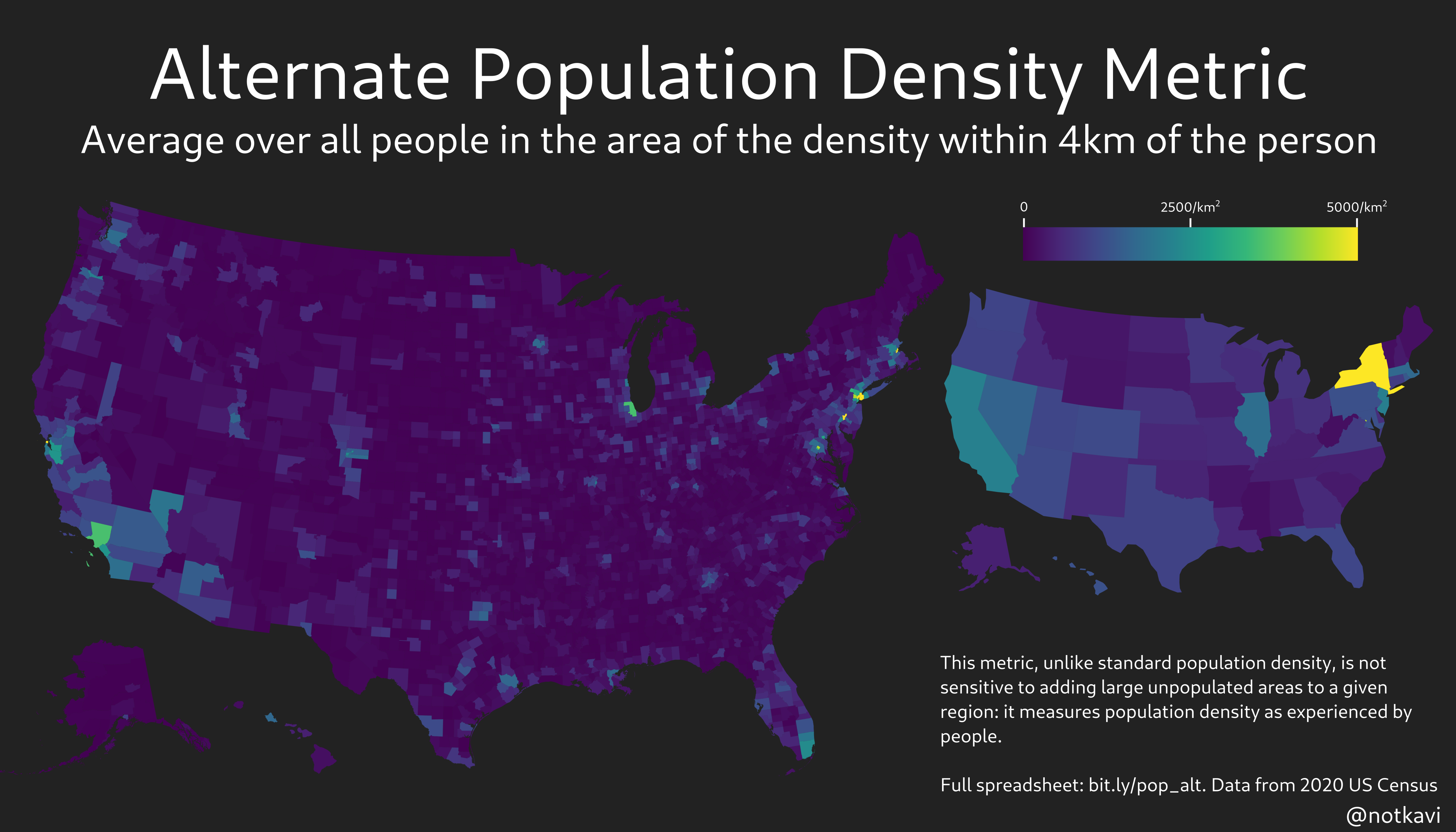
Note that New York State is easily the densest state by any of these metrics, which makes sense since most people in New York State live in very urban areas!
Political analysis
We all know that density predicts electoral outcomes right? Well, here’s what density vs Biden’s share looks like using several different metrics, by county.
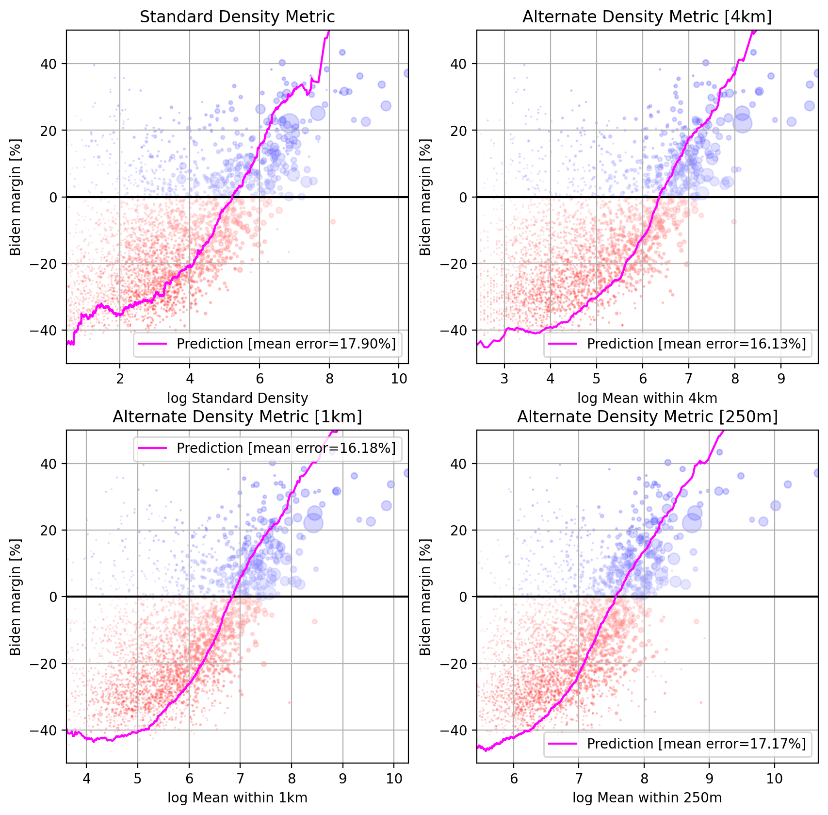
Note that the mean error is lower for the alternate density metric, but by 250m, it starts rising again. This is probably due to the fact that the census data used to construct this is block level, so noise from the exact placement of the blocks starts becoming relevant below 1km or so.
We can also map out the predictions and see what’s going on:
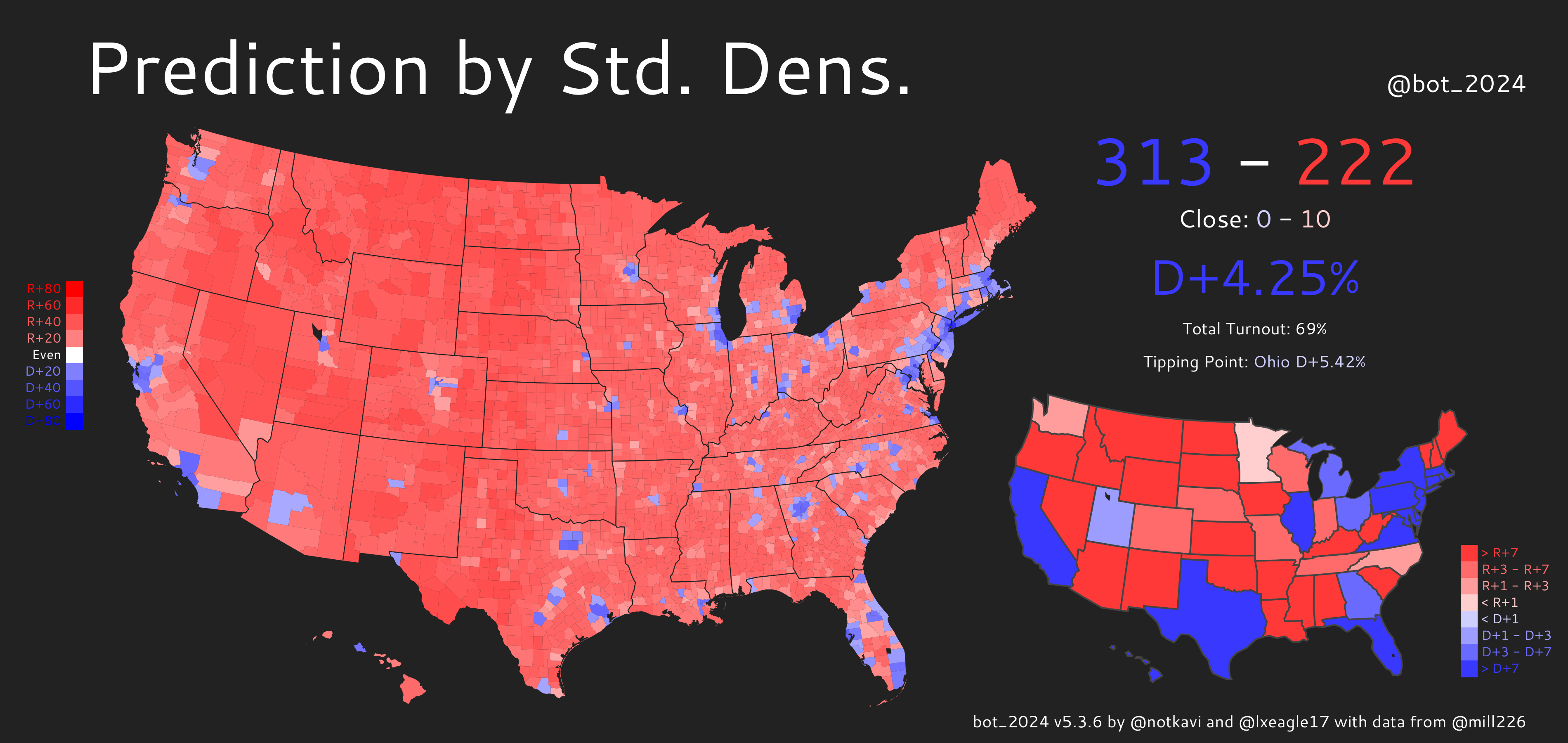
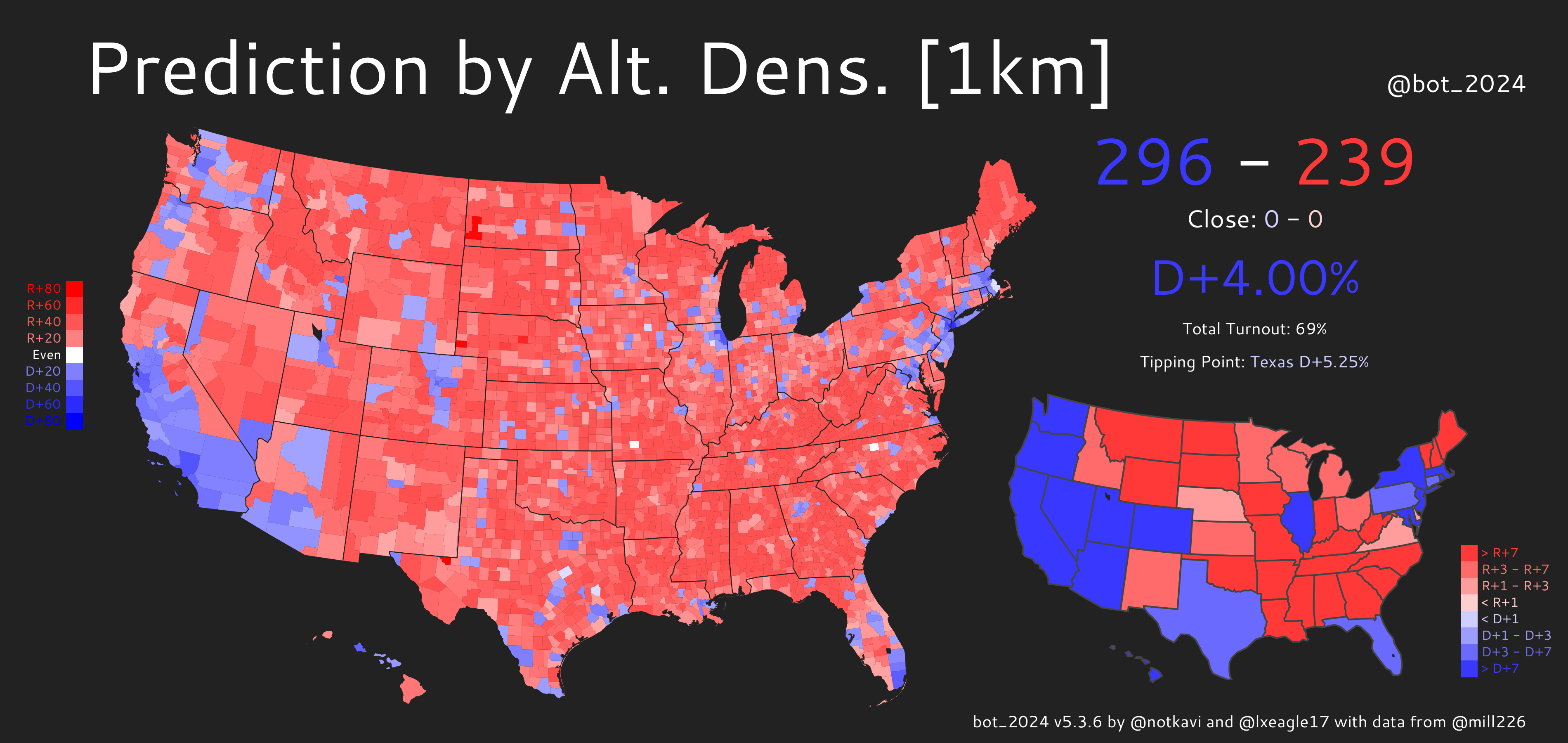
You can see that there’s far fewer blue counties by either of these metrics than Biden actually received, but the alternate density metric produces a better map as it can identify large counties that are nonetheless densely populated, especially in the Western US, where counties tend to be much larger.
We can also see this on the residual maps:
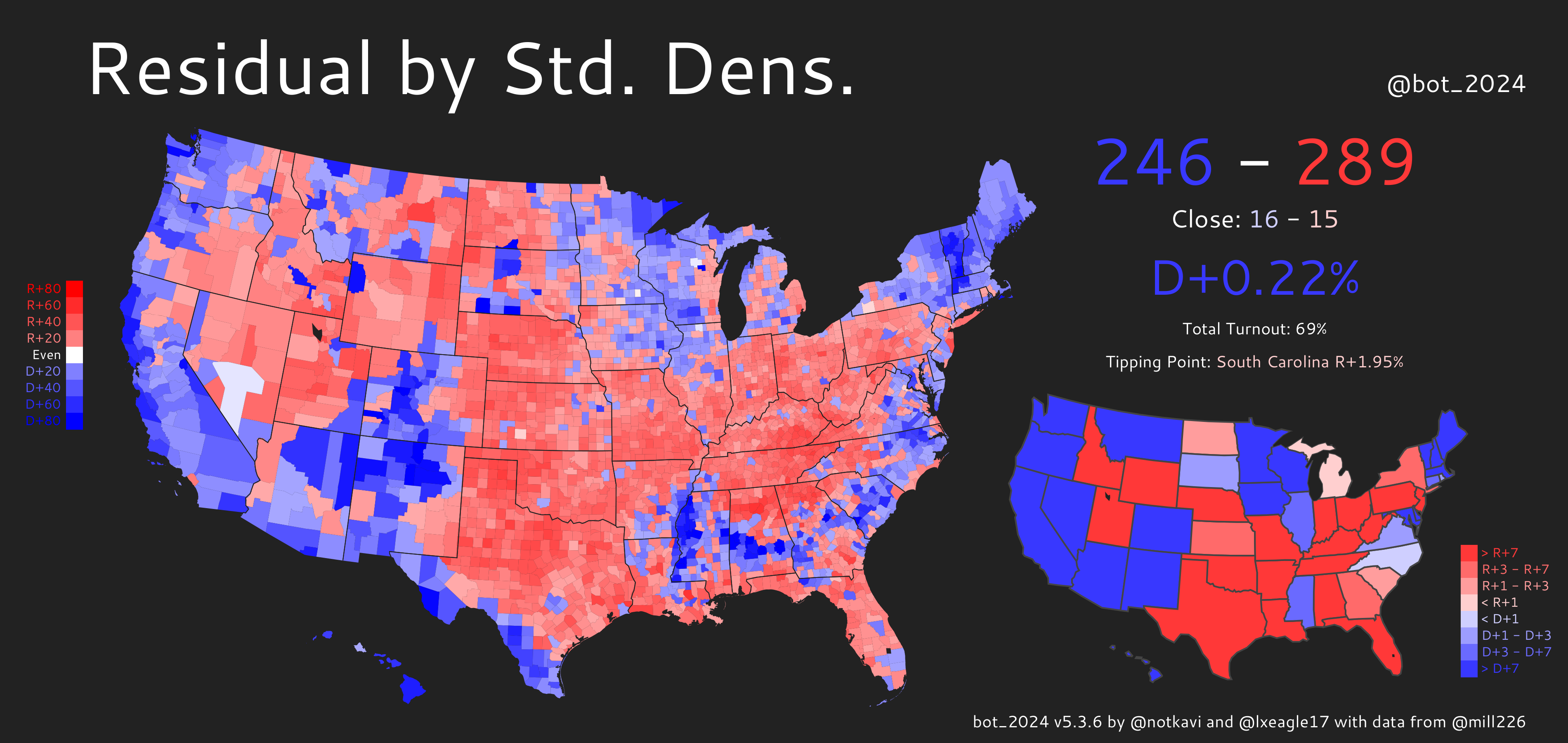
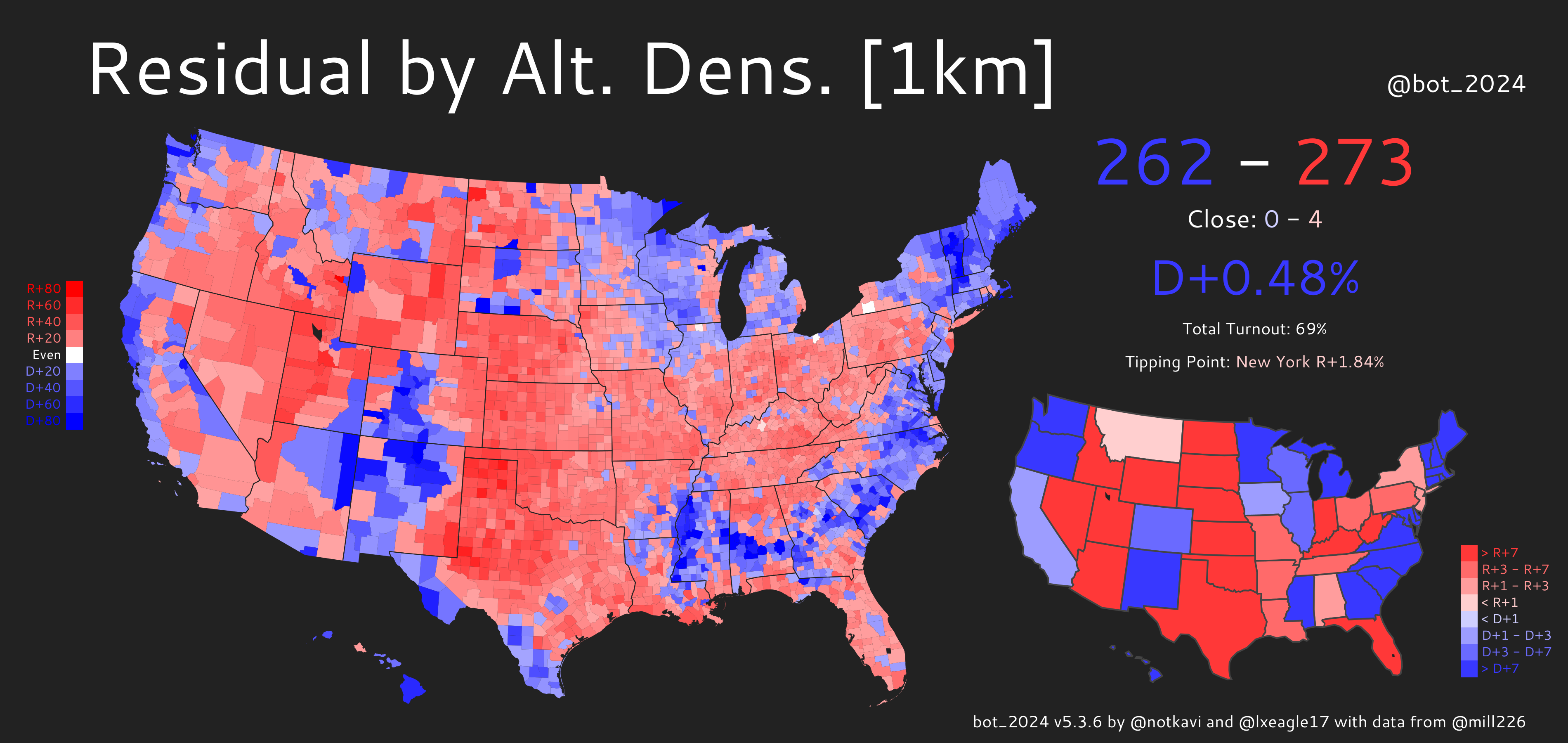
Both maps show obvious patterns where the Great Plains, Appalachia, Utah, and Florida are redder than expected by density, while Native, Hispanic, Black, and secular areas, along with the midwestern Driftless area, are bluer than expected. However, you can see that standard density has an additional pattern where pretty much the entire west is much bluer than expected. This is because the west tends to have large counties such as San Bernardino and Riverside counties (California), Clark County (Nevada), or Maricopa County (Arizona) that are large in area, but are not actually nearly as sparse as the standard density metric would suggest.
One interesting sidenote: in both predictions, the tipping point state’s margin is more Democratic than the popular vote margin. This means that in a neutral, D/R+0 political environment, the Democrats would win!
Consequently, we can see that when only accounting for urban areas being more Democratic, the EC/PV gap would favor Democrats, unlike our current political reality, in which it favors Republicans. One direct implication of this is that the Electoral College actually favors urban areas over rural ones!
Conclusion
Anyways, I hope you enjoy and have something to think about when it comes to calculating density! You can view and download the values by county here. Please let me know if you have any comments, you can reach me at @notkavi on twitter. Thanks to @lxeagle17 for helping with editing, I lack basic grammar skills.